SWAN
Solar & Wind Analysis
In 2021, 336,000,000 kWh of Wind energy and 90,000,000 kWh of Solar energy was generated across all ISO groups. This is only 12.5% of the total energy generation in the United States. However, our data shows that these types of generators are growing in numbers and getting increasingly efficient. Furthermore, with the aid of simulation data, our team provides a visual tool to help developers and researchers pin point ideal locations for future plants.
MACRO Scale Data
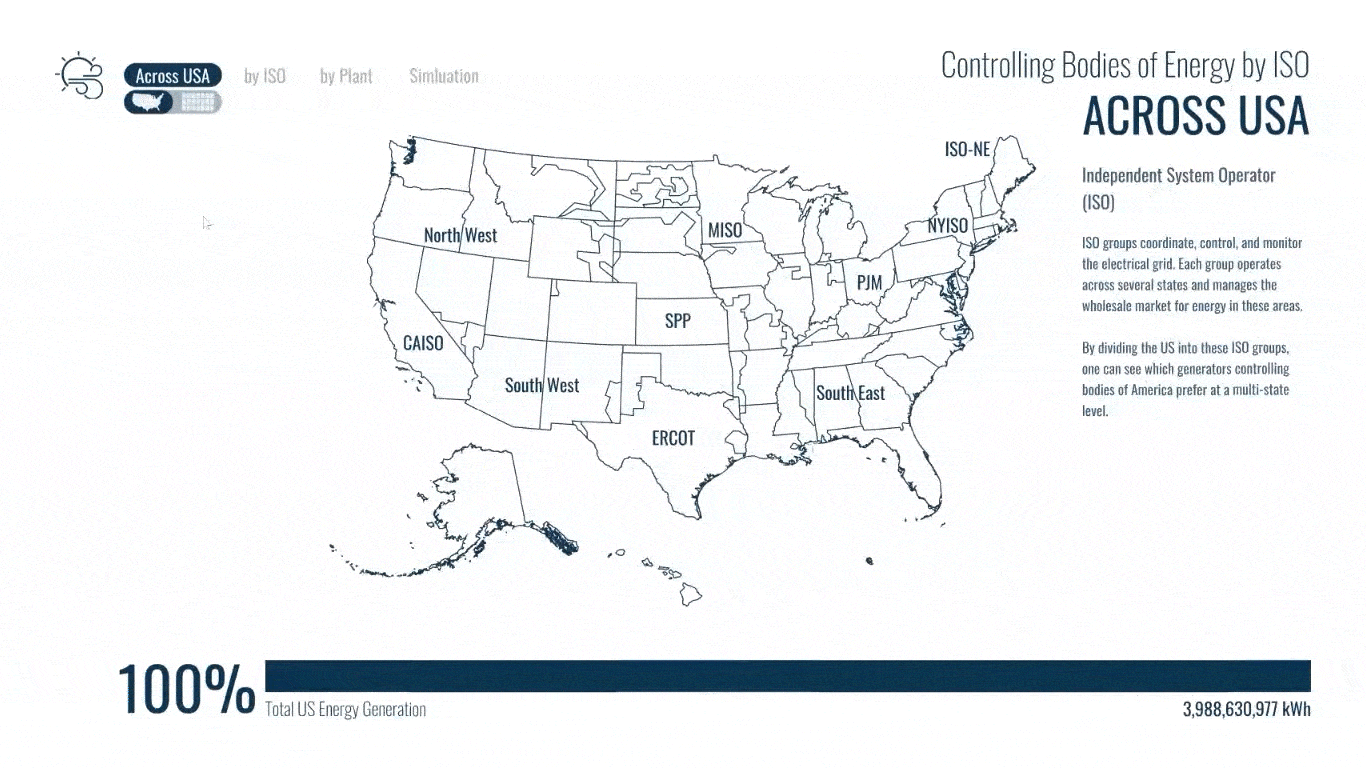
This is a depiction of America divided by ISO groups. ISO stands for Independent System Operator, and they are multi-state bodies that coordinate, and monitor the electrical grid and the energy wholesale market.
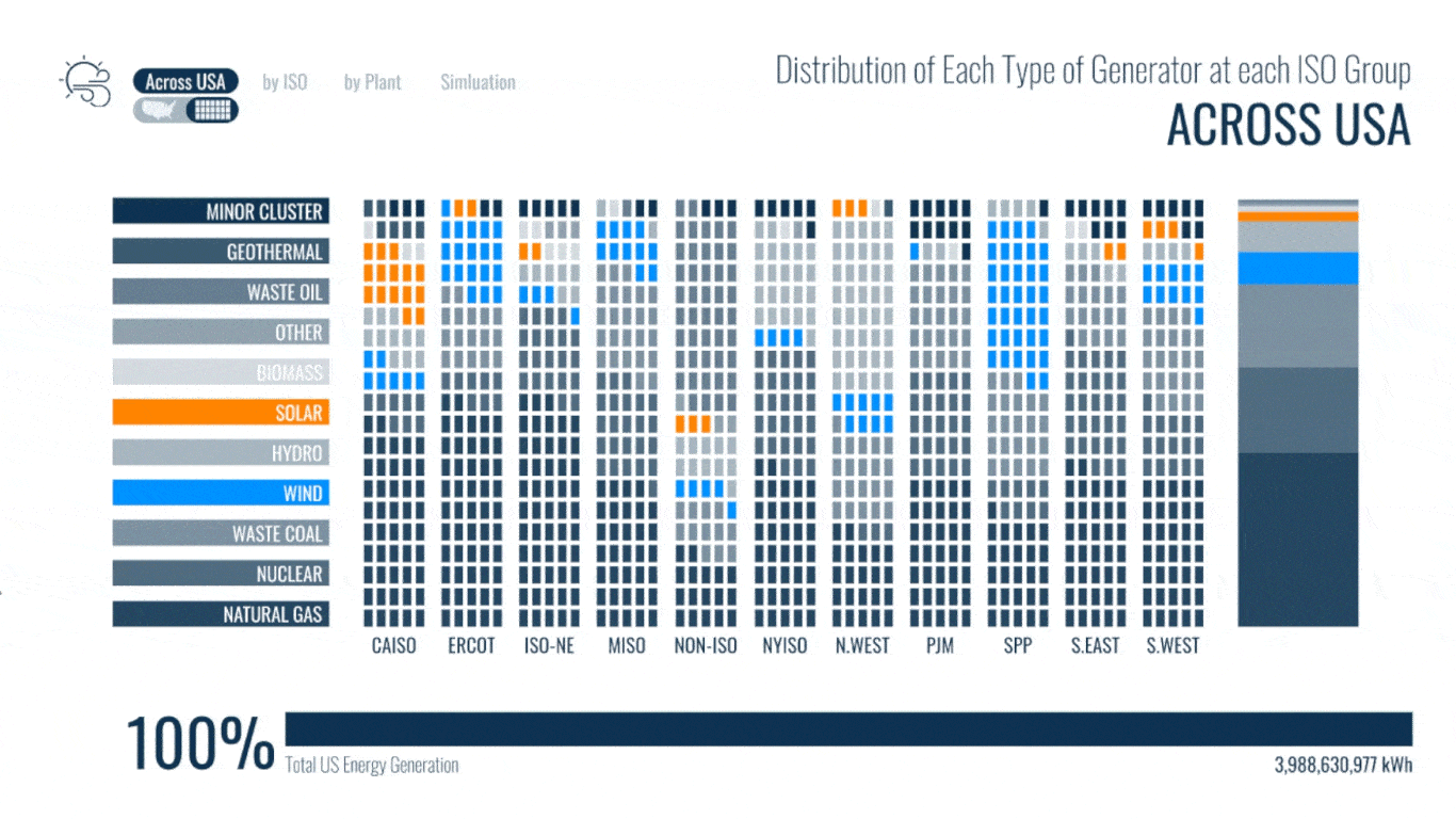
The chart to the left presents the spread of each energy generator type across all ISO groups. It visualizes what type of energy is generated Across America, and what energy type is preferred in each ISO group.
This visualization series will select through options in CAISO as it has high generation in both Wind and Solar plants.
MEZZO to MICRO Scale Data
This visualization series will select through options in CAISO as it has high generation in both Wind and Solar plants.
The scatter plot shows every Energy Plant in the CAISO group. Each circle is placed by its Generator Type and the year the plant was made. The size of circle is determined by the Total Generation of each plant in 2020. Note the really high generation from a single Nuclear plant and the collective generation from Natural Gas. In comparison, we can see that while the number of solar and Wind plants are growing, the generation is still on the lower end. To look into why this might be the case, one of the Wind plants is selected.
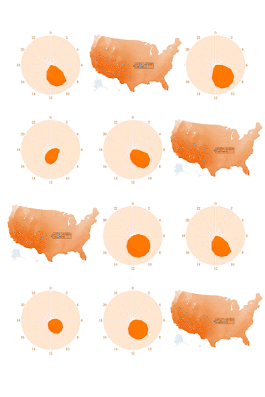
The radar chart shows the hourly Capacity Factor of GREEN POWER I for each day across a year. The capacity Factor is a measure of reliability. We can see that the Wind is very unpredictable. Some days it is inactive. Other days the Capacity Factor is very high.
SEGS VII was selected as an example for Solar plants. Solar is more predictable. However, the Capacity Factor is very dependent on the season, and there is a lot of negative space in the chart. This highlights the extensive period of time when the generator is not being used.


Simulation Data
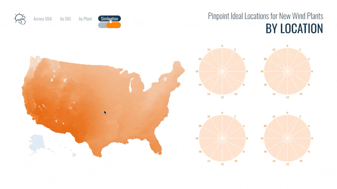
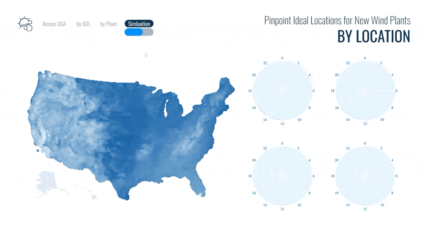
The simulation is used to guide future developers and researchers on ideal locations for installing Solar and Wind energy plants. Above, is a depiction of America through a Solar and Wind map. We can select specific coordinates, and then a collection of radar charts will show the hourly Capacity Factor of a plant placed there.
While Solar and Wind energy is still a small portion of the United State’s energy capacity, the series of data visualizations show the growing popularity of these generator types. It is important to be aware that as these generator types are getting increasingly more efficient these plants still require a lot of resources. The simulation data above helps us be more selective about where we use our resources to build these plants, and helps set goals for the what the capacity factor of these new plants should be.
Video
Process Slides